
Master Responsive Design with CSS Breakpoints and Media Queries
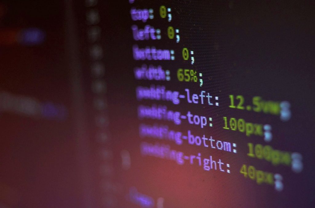
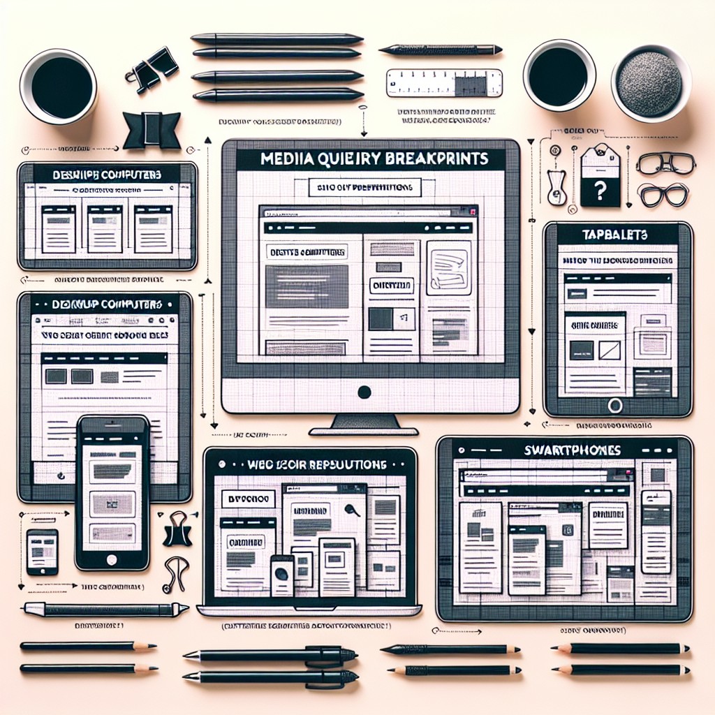
Media Query Breakpoints – How to Create Responsive Designs with CSS Breakpoints and Media Queries Are you looking to enhance your web design skills and create websites that look great on any device? In this comprehensive guide, we will dive deep into the world of CSS breakpoints and media queries to help you understand how […]
Master Responsive Design with CSS Breakpoints and Media Queries Read More »