Media Query Breakpoints – How to Create Responsive Designs with CSS Breakpoints and Media Queries
Are you looking to enhance your web design skills and create websites that look great on any device? In this comprehensive guide, we will dive deep into the world of CSS breakpoints and media queries to help you understand how to make your designs responsive and user-friendly.
Quick View – Breakpoints and Media Query Breakpoints for Responsive Design
Common CSS Breakpoints
/* Styles for Extra Small Devices (Phones) */
@media only screen and (min-width: 320px) {
  /* CSS rules for extra small devices */
}

/* Styles for Small Devices (Phones) */
@media only screen and (min-width: 576px) {
  /* CSS rules for small devices */
}

/* Styles for Medium Devices (Tablets) */
@media only screen and (min-width: 768px) {
  /* CSS rules for medium devices */
}

/* Styles for Large Devices (Desktops) */
@media only screen and (min-width: 992px) {
  /* CSS rules for large devices */
}

/* Styles for Extra Large Devices (Large Desktops) */
@media only screen and (min-width: 1200px) {
  /* CSS rules for extra large devices */
}

/* End of a CSS style block that could be targeting specific media types or features */
Popular CSS Frameworks CSS Breakpoints for Responsive Design
1. Bootstrap – Grid System
Bootstrap is one of the most widely used CSS frameworks, providing a grid system and components for building responsive websites.
- Extra small devices (phones):
- Breakpoint:
576pxand up
- Breakpoint:
- Small devices (phones):
- Breakpoint:
576pxand up
- Breakpoint:
- Medium devices (tablets):
- Breakpoint:
768pxand up
- Breakpoint:
- Large devices (desktops):
- Breakpoint:
992pxand up
- Breakpoint:
- Extra large devices (large desktops):
- Breakpoint:
1200pxand up
- Breakpoint:
/* Styles for Extra Small Devices (Phones) */
@media only screen and (min-width: 576px) {
  /* CSS rules for extra small devices */
}

/* Styles for Small Devices (Phones) */
@media only screen and (min-width: 768px) {
  /* CSS rules for small devices */
}

/* Styles for Medium Devices (Tablets) */
@media only screen and (min-width: 992px) {
  /* CSS rules for medium devices */
}

/* Styles for Large Devices (Desktops) */
@media only screen and (min-width: 1200px) {
  /* CSS rules for large devices */
}
2. Foundation
Foundation is another popular CSS framework known for its responsive grid system, customizable components, and its efficient use of media queries to create responsive designs.
- Small devices (phones):
- Breakpoint:
640pxand up
- Breakpoint:
- Medium devices (tablets):
- Breakpoint:
1024pxand up
- Breakpoint:
- Large devices (desktops):
- Breakpoint:
1440pxand up
- Breakpoint:
/* Styles for Small Devices (Phones) */
@media only screen and (min-width: 640px) {
  /* CSS rules for small devices */
}

/* Styles for Medium Devices (Tablets) */
@media only screen and (min-width: 1024px) {
  /* CSS rules for medium devices */
}

/* Styles for Large Devices (Desktops) */
@media only screen and (min-width: 1440px) {
  /* CSS rules for large devices */
}
3. Tailwind CSS
Tailwind CSS is a utility-first CSS framework that allows you to build custom designs without writing traditional CSS.
- Small devices (phones):
- Breakpoint:
640pxand up
- Breakpoint:
- Medium devices (tablets):
- Breakpoint:
768pxand up
- Breakpoint:
- Large devices (desktops):
- Breakpoint:
1024pxand up
- Breakpoint:
- Extra large devices (large desktops):
- Breakpoint:
1280pxand up
- Breakpoint:
/* Styles for Small Devices (Phones) */
@media only screen and (min-width: 640px) {
  /* CSS rules for small devices */
}

/* Styles for Medium Devices (Tablets) */
@media only screen and (min-width: 768px) {
  /* CSS rules for medium devices */
}

/* Styles for Large Devices (Desktops) */
@media only screen and (min-width: 1024px) {
  /* CSS rules for large devices */
}

/* Styles for Extra Large Devices (Large Desktops) */
@media only screen and (min-width: 1280px) {
  /* CSS rules for extra large devices */
}
4. Bulma
Bulma is a modern CSS framework based on Flexbox, offering a clean and intuitive design.
- Mobile devices:
- Breakpoint:
768pxand up
- Breakpoint:
- Tablets:
- Breakpoint:
1024pxand up
- Breakpoint:
- Desktops:
- Breakpoint:
1280pxand up
- Breakpoint:
/* Styles for Mobile Devices */
@media only screen and (min-width: 768px) {
  /* CSS rules for mobile devices */
}

/* Styles for Tablets */
@media only screen and (min-width: 1024px) {
  /* CSS rules for tablets */
}

/* Styles for Desktops */
@media only screen and (min-width: 1280px) {
  /* CSS rules for desktops */
}
5. Materialize CSS
Materialize CSS is a front-end framework based on Google’s Material Design guidelines.
- Small devices (phones):
- Breakpoint:
600pxand up
- Breakpoint:
- Medium devices (tablets):
- Breakpoint:
992pxand up
- Breakpoint:
- Large devices (desktops):
- Breakpoint:
1200pxand up
- Breakpoint:
/* Styles for Small Devices (Phones) */
@media only screen and (min-width: 600px) {
  /* CSS rules for small devices */
}

/* Styles for Medium Devices (Tablets) */
@media only screen and (min-width: 992px) {
  /* CSS rules for medium devices */
}

/* Styles for Large Devices (Desktops) */
@media only screen and (min-width: 1200px) {
  /* CSS rules for large devices */
}
6. Semantic UI
Semantic UI is a comprehensive CSS framework designed for a simple and intuitive user experience.
-
- Mobile devices:
- Breakpoint:
768pxand up
- Breakpoint:
- Tablets:
- Breakpoint:
768pxand up
- Breakpoint:
- Computer screens:
- Breakpoint:
1024pxand up
- Breakpoint:
- Mobile devices:
/* Styles for Mobile Devices */
@media only screen and (min-width: 768px) {
  /* CSS rules for mobile devices */
}

/* Styles for Tablets */
@media only screen and (min-width: 768px) {
  /* CSS rules for tablets */
}

/* Styles for Computer Screens */
@media only screen and (min-width: 1024px) {
  /* CSS rules for computer screens */
}
Why You Need to Master CSS Breakpoints
As the internet continues to shift towards mobile-first browsing, having a responsive design is no longer a luxury—it’s a must. Understanding CSS breakpoints and media queries enables you to control how your website displays on various devices. This blog post will guide you through the essentials of breakpoints, providing you with the knowledge to create stunning, responsive designs.
Let’s dive into the world of CSS breakpoints, media queries, and responsive design.
Setting the Viewport
Setting the viewport meta tag is essential for ensuring proper display and responsiveness of websites on mobile devices. The viewport meta tag controls the layout of a web page on mobile browsers and helps browsers understand how to scale and display the content. This is especially important when dealing with CSS breakpoints for responsive design.
Here’s an example of how to set the viewport meta tag in the HTML <head> section:
<!DOCTYPE html>
<html>
<head>
  <meta charset="UTF-8">
  <meta name="viewport" content="width=device-width, initial-scale=1.0">
  <title>Your Title Here</title>
  <!-- Other meta tags, CSS links, etc. -->
</head>
<body>
  <!-- Your website content here -->
</body>
</html>
<meta name="viewport" content="width=device-width, initial-scale=1.0">: This meta tag sets the viewport to the width of the device (in this case, the width is set to the device’s screen width). The initial-scale=1.0 ensures that the page is displayed at 100% zoom level when first loaded. This means one CSS pixel equals one device pixel.
Why is ‘Viewport’ Required for Breakpoints?
Setting the viewport meta tag is crucial for breakpoints because it tells the browser how to render the webpage on different devices. Here’s why it’s required:
- Responsive Design: Without setting the viewport meta tag, mobile browsers would render web pages as if they were desktop-sized, leading to a poor user experience with tiny, unreadable text and a need to pinch and zoom to read content. By setting the viewport, the browser knows how to scale the content based on the device’s screen width.
- Media Queries: CSS breakpoints rely on the viewport meta tag to function correctly. Media queries are based on the width of the viewport, and without an accurately set viewport, the breakpoints won’t trigger as expected. For example, if you set a breakpoint at
768px, it refers to the width of the viewport as defined by the meta tag. - Adaptability: The viewport meta tag allows websites to adapt to various device sizes and orientations. It ensures that your website looks good and functions well on devices ranging from small smartphones to large desktop monitors.
Adding A Breakpoint – Responsive Web Design for Mobile First Approach
Using breakpoints for a mobile-first design approach involves starting with styles for smaller devices (like smartphones) and then applying additional styles as the screen size increases. This ensures that your website is optimized for mobile devices by default, and then enhanced for larger screens. You will notice that the example code above the smallest breakpoint comes first and starts with a width from 600px or more. This means that smaller screens such as mobiles follow the basic css commands and only change if the screen is larger.
What Are CSS Breakpoints?
CSS breakpoints are specific points in your CSS code where the layout of your webpage will change to accommodate different screen sizes. These breakpoints are defined using media queries, which allow you to apply specific styles based on characteristics such as screen width, height, device orientation, and more. For example, you might want your website to display in a single-column layout on mobile devices but switch to a multi-column layout on larger devices.
When a device’s screen size matches the conditions specified in your media query, the corresponding CSS rules are applied, ensuring that your website adapts seamlessly to different devices.
Why Are Media Queries Essential for Responsive Design?
Media queries are the backbone of responsive web design. They enable you to tailor the presentation of your content based on the characteristics of the device displaying the webpage. By using media queries, you can create a fluid and adaptive layout that looks great on screens of all sizes.
For example, you can define media queries to adjust the layout of your navigation menu, font sizes, image sizes, and more. This flexibility ensures that users have an optimal viewing experience regardless of whether they’re using a desktop computer, tablet, or smartphone.
How to Use CSS Breakpoints Effectively
To use CSS breakpoints effectively, it’s essential to consider your website’s grid system. A grid provides structure and alignment to your layout, and breakpoints should align with your grid columns. For instance, if your grid system has 12 columns, you might set breakpoints at intervals that align with these columns, such as at 768px for tablet devices and 1200px for desktops.
Additionally, consider the viewport meta tag in your HTML. This tag tells the browser how to control the page’s dimensions and scaling. By setting the viewport width to the device width, you ensure that your media queries and breakpoints respond accurately to the user’s real device.
Best Practices for Choosing Breakpoints
Choosing the right breakpoints can significantly impact the responsiveness of your design. While there are no strict rules, some best practices can guide you:
- Start with Common Device Breakpoints: Consider the most common screen sizes for devices like smartphones, tablets, and desktops. Common breakpoints include 320px for smartphones, 768px for tablets, and 1200px for desktops.
- Design for Mobile First: Begin your design process with mobile screens in mind. This approach ensures that your design is optimized for smaller screens, with additional styles added as the screen size increases.
- Consider Content and Layout: Base breakpoints on when your content starts to look cramped or stretched. Adjust breakpoints accordingly to maintain an optimal reading experience.
- Test Across Devices: Use responsive testing tools to preview your design on various devices and resolutions. This allows you to fine-tune breakpoints for different screen sizes.
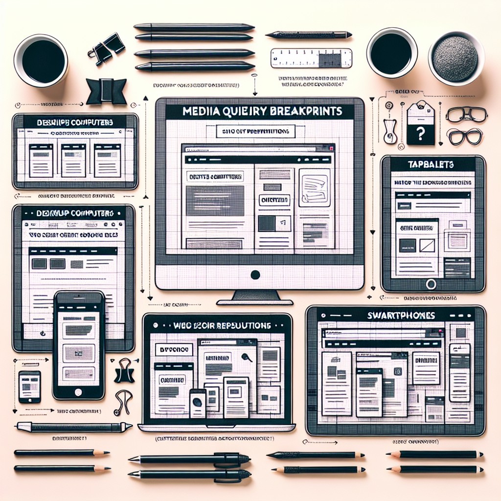
CSS Media Queries and Typical Device Breakpoints
Apple Devices
- iPhone 5/SE (Portrait)
- Breakpoint:
320px - Description: iPhone 5 and SE in portrait mode.
- Breakpoint:
- iPhone 6/7/8 (Portrait)
- Breakpoint:
375px - Description: iPhone 6, 7, and 8 in portrait mode.
- Breakpoint:
- iPhone 6/7/8 Plus (Portrait)
- Breakpoint:
414px - Description: iPhone 6, 7, and 8 Plus in portrait mode.
- Breakpoint:
- iPhone X/XS (Portrait)
- Breakpoint:
375px - Description: iPhone X and XS in portrait mode.
- Breakpoint:
- iPhone XR/XS Max (Portrait)
- Breakpoint:
414px - Description: iPhone XR and XS Max in portrait mode.
- Breakpoint:
- iPad (Portrait)
- Breakpoint:
768px - Description: iPad in portrait mode.
- Breakpoint:
- iPad Pro 10.5″ (Portrait)
- Breakpoint:
834px - Description: iPad Pro 10.5″ in portrait mode.
- Breakpoint:
- iPad Pro 12.9″ (Portrait)
- Breakpoint:
1024px - Description: iPad Pro 12.9″ in portrait mode.
- Breakpoint:
- iPad (Landscape)
- Breakpoint:
1024px - Description: iPad in landscape mode.
- Breakpoint:
- iPad Pro 10.5″ (Landscape)
- Breakpoint:
1112px - Description: iPad Pro 10.5″ in landscape mode.
- Breakpoint:
- iPad Pro 12.9″ (Landscape)
- Breakpoint:
1366px - Description: iPad Pro 12.9″ in landscape mode.
- Breakpoint:
Example Usage in Media Queries for Specific Apple Devices
/* Styles for iPhone 5/SE (Portrait) */
@media only screen and (min-width: 320px) {
  /* CSS rules for iPhone 5/SE */
}

/* Styles for iPhone 6/7/8 (Portrait) */
@media only screen and (min-width: 375px) {
  /* CSS rules for iPhone 6/7/8 */
}

/* Styles for iPhone 6/7/8 Plus (Portrait) */
@media only screen and (min-width: 414px) {
  /* CSS rules for iPhone 6/7/8 Plus */
}

/* Styles for iPhone X/XS (Portrait) */
@media only screen and (min-width: 375px) {
  /* CSS rules for iPhone X/XS */
}

/* Styles for iPhone XR/XS Max (Portrait) */
@media only screen and (min-width: 414px) {
  /* CSS rules for iPhone XR/XS Max */
}

/* Styles for iPad (Portrait) */
@media only screen and (min-width: 768px) {
  /* CSS rules for iPad */
}

/* Styles for iPad Pro 10.5" (Portrait) */
@media only screen and (min-width: 834px) {
  /* CSS rules for iPad Pro 10.5" */
}

/* Styles for iPad Pro 12.9" (Portrait) */
@media only screen and (min-width: 1024px) {
  /* CSS rules for iPad Pro 12.9" */
}

/* Styles for iPad (Landscape) */
@media only screen and (min-width: 1024px) {
  /* CSS rules for iPad in landscape mode */
}

/* Styles for iPad Pro 10.5" (Landscape) */
@media only screen and (min-width: 1112px) {
  /* CSS rules for iPad Pro 10.5" in landscape mode */
}

/* Styles for iPad Pro 12.9" (Landscape) */
@media only screen and (min-width: 1366px) {
  /* CSS rules for iPad Pro 12.9" in landscape mode */
}
Android Devices
- Google Pixel 2 (Portrait)
- Breakpoint:
411px - Description: Google Pixel 2 in portrait mode.
- Breakpoint:
- Google Pixel 2 XL (Portrait)
- Breakpoint:
411px - Description: Google Pixel 2 XL in portrait mode.
- Breakpoint:
- Samsung Galaxy S5 (Portrait)
- Breakpoint:
360px - Description: Samsung Galaxy S5 in portrait mode.
- Breakpoint:
- Samsung Galaxy S6 (Portrait)
- Breakpoint:
360px - Description: Samsung Galaxy S6 in portrait mode.
- Breakpoint:
- Samsung Galaxy S7 (Portrait)
- Breakpoint:
360px - Description: Samsung Galaxy S7 in portrait mode.
- Breakpoint:
- Samsung Galaxy S8 (Portrait)
- Breakpoint:
360px - Description: Samsung Galaxy S8 in portrait mode.
- Breakpoint:
- Samsung Galaxy S9 (Portrait)
- Breakpoint:
360px - Description: Samsung Galaxy S9 in portrait mode.
- Breakpoint:
- Samsung Galaxy S10 (Portrait)
- Breakpoint:
360px - Description: Samsung Galaxy S10 in portrait mode.
- Breakpoint:
- Samsung Galaxy Note 5 (Portrait)
- Breakpoint:
360px - Description: Samsung Galaxy Note 5 in portrait mode.
- Breakpoint:
- Samsung Galaxy Note 8 (Portrait)
- Breakpoint:
414px - Description: Samsung Galaxy Note 8 in portrait mode.
- Breakpoint:
Example Usage in Media Queries for Specific Android Devices
/* Styles for Google Pixel 2 (Portrait) */
@media only screen and (min-width: 411px) {
  /* CSS rules for Google Pixel 2 */
}

/* Styles for Samsung Galaxy S5 (Portrait) */
@media only screen and (min-width: 360px) {
  /* CSS rules for Samsung Galaxy S5 */
}

/* Styles for Samsung Galaxy S8 (Portrait) */
@media only screen and (min-width: 360px) {
  /* CSS rules for Samsung Galaxy S8 */
}

/* Styles for Samsung Galaxy Note 8 (Portrait) */
@media only screen and (min-width: 414px) {
  /* CSS rules for Samsung Galaxy Note 8 */
}
Implementing CSS Breakpoints with Sass
If you’re using Sass (Syntactically Awesome Style Sheets), managing breakpoints becomes even more efficient. Sass allows you to define breakpoints as variables, making it easy to update them across your stylesheets. Here’s an example of how you might define and use breakpoints in Sass:
$breakpoint-small: 576px;
$breakpoint-medium: 768px;
$breakpoint-large: 992px;

@mixin respond-to($breakpoint) {
  @media screen and (min-width: $breakpoint) {
    @content;
  }
}

.my-element {
  width: 100%;

  @include respond-to($breakpoint-medium) {
    width: 50%;
  }

  @include respond-to($breakpoint-large) {
    width: 33.333%;
  }
}
By using Sass mixins and variables, you can create more maintainable and organized CSS for your responsive designs.
Common CSS Frameworks and Their Breakpoints
Many CSS frameworks come with predefined breakpoints that you can leverage for your designs. Here are a few examples:
- Bootstrap:
- Small devices (phones): 576px and up
- Medium devices (tablets): 768px and up
- Large devices (desktops): 992px and up
- Foundation:
- Small devices (phones): 640px and up
- Medium devices (tablets): 1024px and up
- Large devices (desktops): 1440px and up
Understanding the breakpoints provided by these frameworks can streamline your design process and ensure consistency across different projects.
Responsive Testing: Ensuring Cross-Device Compatibility
After implementing your CSS breakpoints and media queries, it’s crucial to test your website across various devices. Responsive testing tools like BrowserStack, Responsinator, or Chrome DevTools’ Device Mode allow you to simulate how your site appears on different devices.
By testing on actual mobile devices and emulators, you can identify any layout issues and ensure that your design looks polished across the board. Remember, designing for mobile-first doesn’t just mean scaling down; it means optimizing the user experience for smaller screens.
8. Designing with a Mobile-First Approach
Designing with a mobile-first approach involves more than just layout adjustments. It also includes considerations for font sizes and overall user experience. When setting font sizes, consider using relative units like rem or em rather than fixed pixel sizes. This ensures that fonts scale appropriately based on the user’s device settings.
Media queries can also target specific device orientations (landscape vs. portrait) to provide tailored experiences. For example, you might adjust the navigation menu layout for landscape orientation on tablets.
9. Font Size and Breakpoints
Font sizes play a crucial role in responsive design, especially when dealing with different viewport sizes. You can use media queries to adjust font sizes based on the screen width, ensuring readability across devices.
For example, you might define font sizes like this:
body {
  font-size: 16px;
}

@media screen and (min-width: 768px) {
  body {
    font-size: 18px;
  }
}

@media screen and (min-width: 1200px) {
  body {
    font-size: 20px;
  }
}
This approach allows text to remain legible whether viewed on a small smartphone or a large desktop monitor.
10. Summary: Key Points to Remember
- CSS breakpoints are specific points in your CSS code where the layout changes for different screen sizes.
- Media queries allow you to apply specific styles based on device characteristics.
- Start with common device breakpoints when designing for responsiveness.
- Consider a mobile-first approach to ensure optimal design for smaller screens.
- Use CSS frameworks and Sass for efficient breakpoint management.
- Test your responsive design across various devices using responsive testing tools.
- Font sizes should be adjustable using relative units like
remorem. - Remember to design with a focus on the user’s experience on mobile devices.
In conclusion, mastering CSS breakpoints and media queries is essential for creating modern, responsive web designs. By understanding how to use breakpoints effectively, you can ensure that your websites look great and function seamlessly across a wide range of devices. So, whether you’re designing for a smartphone, tablet, or desktop, remember to utilize CSS breakpoints to craft an exceptional user experience for all your visitors.

I am a self-motivated, passionate website designer and developer. I have over ten years of experience in building websites and have developed a broad skill set including web design, frontend and backend development, and SEO.
Using my growing knowledge base I have built my own company (scriptedart.co.uk) creating websites, e-commerce stores and producing custom graphics and web app functionality for a range of local businesses.