Best Landing Page Examples to Inspire and Boost Your Conversion Rate in 2024
Introduction: Why Good Landing Page Examples Matter
To create a landing page is to start your customer’s journey to a particular goal. A well-crafted landing page can make all the difference in capturing attention, conveying value, and ultimately driving action. In this article, we’ll dive into the world of landing page design, focusing on examples that inspire and inform. Whether you’re a seasoned marketer looking for fresh ideas or a newcomer seeking guidance, this exploration of landing page examples for 2024 will provide valuable insights.
Example of Simple Landing Pages
WDB Community
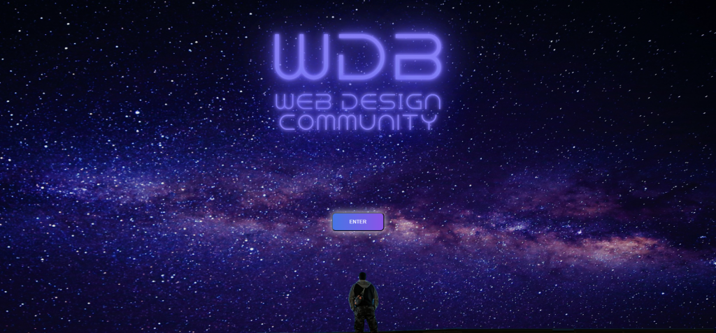
- Link: WDB Community Landing Page
- Description: A Basic example of a landing page without much more page content than a CTA. A compelling page design with a single option to enter the Community.
Uber Eats: New User Promotion
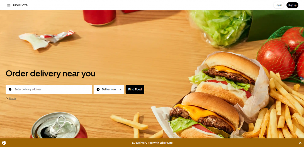
- Link: Uber Eats Landing Page
- Description: Uber Eats’ landing page for new users offers a clear promotion for first-time orders. The page highlights the ease of ordering food and the variety of options available.
Netflix: Streaming Service
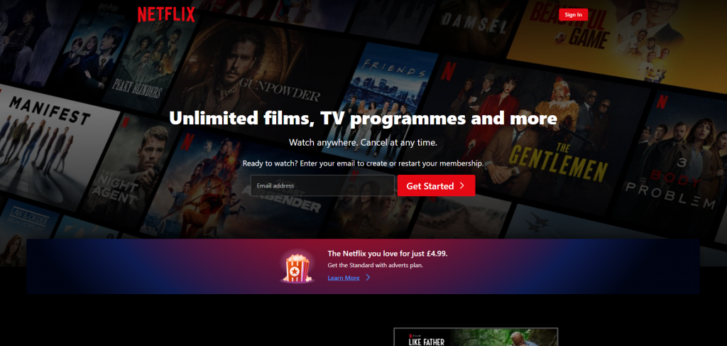
- Link: Netflix Landing Page
- Description: Netflix’s landing page is simple yet effective. It highlights popular shows and movies, offers personalized recommendations, and prompts visitors to sign up for a free trial.
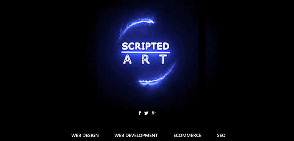
Scripted Art: Our Own Landing Page
- Link: Scripted Art Landing Page
- Description: Our own example of what a simple landing page looks like. Over half of the page consists of our logo with our social media links below and then links to our services at the bottom of the page.
More Examples of Landing Pages
Headspace: Meditation App
- Link: Headspace Landing Page
- Description: Headspace’s landing page focuses on the benefits of their meditation app. It includes compelling visuals, customer testimonials, and a clear call-to-action to start a free trial.
Shopify: Ecommerce Platform
- Link: Shopify Landing Page
- Description: Shopify’s landing page is designed to attract businesses looking to start or improve their online stores. It showcases key features, success stories, and a “Start Free Trial” CTA.
Slack: Team Communication
- Link: Slack Landing Page
- Description: Slack’s landing page showcases its team communication platform with a clean design. It includes customer quotes, features, and a “Get Started” CTA.
Webflow: Website Builder
- Link: Webflow Landing Page
- Description: Webflow’s landing page targets web designers and developers with its visual website builder. It highlights design tools, templates, and a “Start Designing” CTA.
Casper: Mattress Company
- Link: Casper Landing Page
- Description: Casper’s landing page for its mattresses focuses on comfort and quality. It includes customer reviews, product details, and a “Shop Now” CTA.
Grammarly: Writing Assistant
- Link: Grammarly Landing Page
- Description: Grammarly’s landing page highlights its writing assistant software. It includes examples of errors it can correct, benefits for different users (students, professionals), and a “Get Started” CTA.
Asana: Project Management
- Link: Asana Landing Page
- Description: Asana’s landing page focuses on its project management platform for teams. It includes visuals of the software in action, benefits for different industries, and a “Try for Free” CTA.
Airbnb: Travel Accommodations
- Link: Airbnb Landing Page
- Description: Airbnb’s landing page is personalized based on location and preferences. It showcases unique stays, experiences, and a “Get Started” CTA for booking accommodations.
What Defines a Great Landing Page?
Why are landing pages essential for online success?
Landing pages serve as the virtual storefronts of the digital world. They are purpose-built to guide visitors towards a specific action, whether it’s making a purchase, signing up for a service, or downloading content. Unlike traditional web pages, landing pages are designed with a singular focus, eliminating distractions and honing in on the intended conversion goal.
What distinguishes a landing page from other web pages?
A key characteristic of landing pages is their laser-focused approach. They are tailored to a specific audience and offer, with minimal navigation options to keep visitors on track. While a homepage or product page may provide an array of information and links, a landing page is designed to drive conversions with a clear call to action (CTA).
Examples of exceptional landing pages that convert.
Consider the landing page example from Squarespace, a website-building platform, as one of the landing page examples of 2023. The headline “Build a Website that Works” immediately communicates the benefit to visitors. The CTA, “Start Your Free Trial,” is prominently displayed, encouraging immediate action. The page features sleek visuals of website templates, giving visitors a glimpse of what they can achieve with Squarespace.
Another standout example is from Dropbox. The headline “Bring Your Files Together in One Place” speaks directly to the pain point of scattered files. The CTA, “Sign Up for Free,” is clear and enticing. The landing page offers a visual demonstration of the service’s features, highlighting its simplicity and utility.
What Makes a Landing Page Effective? Key Elements of High-Converting Landing Pages
Is it better to place CTAs at the top or bottom of a page?
The placement of CTAs depends on various factors, including the length and purpose of the landing page. For shorter pages, placing the CTA at the top ensures it’s immediately visible without scrolling. Longer pages may benefit from a CTA at the bottom, after visitors have been convinced by the content.
The art of crafting compelling headlines and subheadlines.
Headlines are the first impression visitors get of your landing page. They should be clear, concise, and relevant to the offer. Subheadlines provide additional context and support, guiding visitors through the page.
Leveraging visuals effectively: Images, videos, and infographics.
Visual elements play a crucial role in capturing attention and conveying information quickly. High-quality images, engaging videos, and informative infographics can all contribute to a visually appealing and effective landing page.
Mastering Landing Page Copywriting
The role of persuasive language in landing page copy.
Effective copywriting is about more than just describing a product or service—it’s about persuading visitors to take action. Use language that resonates with your audience’s needs and desires, focusing on benefits rather than just features.
Best practices for creating engaging headlines and body content.
Headlines should grab attention and spark curiosity. Body content should be scannable, with bullet points and bold text to highlight key information. Tell a compelling story that leads visitors towards the CTA.
Showcasing landing pages with exceptional copywriting.
Take a look at Airbnb’s landing page for hosting. The headline “Earn Money as an Airbnb Host” is straightforward and enticing. The subheadline provides a clear benefit: “Rent out your space on the world’s leading community-driven hospitality company.”
The Science of Effective CTAs (Call to Actions)
What makes a CTA button stand out?
CTA buttons should be visually distinct, using contrasting colors to draw attention. The text should be action-oriented, telling visitors exactly what to do next. For example, “Get Started,” “Join Now,” or “Download Your Guide.”
CTA examples that drive immediate action.
Netflix’s landing page for new subscribers showcases a compelling CTA: “Watch anywhere. Cancel anytime.” This simple yet powerful message communicates the platform’s value proposition and encourages sign-ups.
Enhancing User Experience (UX) and Navigation
The impact of a clear and intuitive layout on user experience.
A cluttered or confusing layout can lead to frustration and high bounce rates. Ensure your landing page has a clean design with a clear hierarchy of information. Use ample white space to guide visitors’ eyes to the most important elements.
Why mobile responsiveness is non-negotiable for landing pages.
With a significant portion of internet traffic coming from mobile devices, it’s crucial for landing pages to be optimized for smaller screens. Responsive design ensures that your landing page looks and functions well on smartphones and tablets.
Examining landing pages with exceptional UX design.
HubSpot’s landing page for its CRM software demonstrates excellent UX design. The layout is clean and organized, with a clear value proposition: “Get started for free.” The page is easy to navigate, with concise sections highlighting key features and benefits.
2024 Landing Page Design Trends
Minimalist vs. detailed design: Advantages and disadvantages.
Minimalist designs focus on simplicity and clarity, while detailed designs can be visually rich and engaging. The trend in 2024 leans towards minimalist designs that prioritize usability and conversion.
Utilizing colour psychology to boost conversions.
Colours can evoke emotions and influence behaviour, a principle that the page gets right by choosing hues that match the brand identity. For example, blue conveys trust and security, while red can create a sense of urgency. Choose colours that align with your brand and the emotions you want to evoke in visitors.
Exploring interactive elements on modern landing pages.
Interactive elements such as quizzes, calculators, or product demos can increase engagement and time spent on your landing page. They provide an opportunity for visitors to interact with your brand and learn more about your product or service.
Product Landing Page Examples That Sell
Effectively showcasing products or services on landing pages.
Apple’s landing page for the latest iPhone is a prime example of effective product showcasing. The page features stunning visuals of the phone, highlighting its design and features. The headline, “Meet the New iPhone,” is accompanied by clear CTA buttons for different models.
The power of testimonials and social proof.
Testimonials and reviews from satisfied customers build trust and credibility. Including snippets of positive feedback or star ratings can reassure visitors and encourage conversions.
Demonstrating value through features and benefits.
Focus on the unique features and benefits of your product or service. Airbnb’s landing page for experiences highlights the diverse range of activities available, from cooking classes to guided tours. The page showcases enticing images and brief descriptions to spark interest.
Optimisation Best Practices for Landing Pages
Harnessing analytics to optimize landing page performance.
Tools like Google Analytics provide valuable insights into visitor behaviour. Monitor metrics such as bounce rate, time on page, and conversion rate to identify areas for improvement.
Identifying and rectifying common landing page pitfalls.
Common pitfalls include slow loading times, unclear CTAs, or too much text. A/B testing different elements can help you find the most effective combinations.
Continuous improvement through testing and iteration.
Optimization is an ongoing process. Regularly test different headlines, images, CTAs, and layouts to see what resonates best with your audience. Don’t be afraid to make changes based on data-driven insights.
Simplicity in Landing Page Design
The effectiveness of simplicity in landing page layouts.
Google’s search landing page is a classic example of simplicity. The focus is entirely on the search bar, with minimal distractions. This straightforward design has become iconic and highly effective.
Examples of minimalist yet impactful landing page designs.
Shopify’s landing page for e-commerce businesses is another example of minimalist design. The page features a clean layout with a prominent headline, clear CTA buttons, and brief descriptions of key features. The simplicity of the design allows visitors to focus on the platform’s benefits.
Innovative Landing Page Ideas to Inspire
Drawing inspiration from diverse industries.
Don’t limit yourself to your own industry. Explore landing pages from various sectors to get fresh ideas and perspectives. What works for one type of product or service might translate well to yours.
Incorporating innovative elements into landing page designs.
Airbnb’s landing page for experiences takes a unique approach by showcasing user-generated content. Visitors can browse through photos and reviews from previous participants, creating a sense of authenticity and trust.
Unconventional yet successful landing page examples.
The Slack landing page for teams is a standout example of unconventional design. The page features a minimalist layout with a bold headline and clear CTA buttons. The use of animated illustrations adds a touch of creativity and personality to the page.
More Examples of Great Landing Pages
Squarespace
- URL: https://www.squarespace.com/
- Why it’s great: Squarespace’s landing page is a stellar example of clean design and effective messaging. The headline “Build a Website that Works” immediately communicates the benefit to potential users. The CTA “Start Your Free Trial” is prominently displayed, encouraging immediate action. Visually, the page is striking with sleek templates showcasing what users can achieve with Squarespace.
Dropbox
- URL: https://www.dropbox.com/
- Why it’s great: Dropbox’s landing page is focused and impactful. The headline “Bring Your Files Together in One Place” addresses a common pain point for users. The CTA “Sign Up for Free” is clear and compelling. Visually, the page is simple yet effective, showcasing the service’s features and benefits.
HubSpot
- URL: https://www.hubspot.com/
- Why it’s great: HubSpot’s landing page for its CRM software is well-designed and user-friendly. The headline “Get started for free” is immediately attention-grabbing. The page features clear CTAs for different products, guiding users to take the next steps. It also includes social proof and customer testimonials to build trust throughout the page.
Airbnb (Hosting)
- URL: https://www.airbnb.com/host/homes
- Why it’s great: Airbnb’s landing page for hosting is persuasive and informative. The headline “Earn Money as an Airbnb Host” speaks directly to the target audience. The page features clear steps to get started and highlights the benefits of becoming a host, such as flexible scheduling and earning potential.
Apple (iPhone)
- URL: https://www.apple.com/iphone/
- Why it’s great: Apple’s landing page for the iPhone is visually stunning and informative. The headline “Meet the New iPhone” captures attention, while the page showcases the phone’s features and benefits with high-quality images and videos. The “Buy” CTA buttons are strategically placed to encourage purchase.
These examples illustrate different approaches to creating effective landing pages, from compelling headlines and clear CTAs to engaging visuals and user-friendly layouts. By studying these examples, you can gain inspiration for your own landing pages and apply similar principles to drive conversions and engagement.
Conclusion: Key Takeaways
- Landing pages are crucial for guiding visitors towards a specific action.
- Elements like compelling headlines, clear CTAs, and effective visuals contribute to a landing page’s success.
- Mobile responsiveness is essential in today’s digital landscape.
- Continuous testing and optimization are key to improving landing page performance.
- Drawing inspiration from diverse industries and incorporating innovative elements can set your landing page apart.
By exploring these best landing page examples of 2024 and understanding the principles behind their success, you’re equipped to create landing pages that not only look great but also drive results. Whether you’re aiming for increased conversions, lead generation, or brand awareness, implementing these insights can elevate your landing page game. So, roll up your sleeves, test your landing pages, and watch your online presence soar!
Remember These Key Points:
- Define your landing page’s purpose clearly.
- Craft compelling headlines and subheadings.
- Use visuals wisely to enhance engagement.
- Ensure seamless navigation and mobile responsiveness.
- Test, analyze, and iterate for continual improvement.
Frequently Asked Questions
1. What are some landing page examples to inspire my design?
When looking for the best landing page examples, consider landing pages that are good landing and high-converting. A great landing page usually has top of the page design elements and offers an effective user experience throughout the entire page.
2. How can I create an effective landing page design?
To create an effective landing page, focus on landing page design examples that land on the page quickly and make a landing page visually appealing. Incorporate product or service information so that landing pages look and engage the visitor right from the start.
3. What elements should a high-converting landing page include?
A high-converting landing page should have a product landing focus and the landing page should include call-to-action buttons. Look for great landing page examples that create a high-converting landing page with landing page copy that convinces visitors to take action.
4. How can I optimize my landing page for better performance?
To optimize your landing page, test different variations of the page to give content and layout. Make sure your page makes effective use of page offers and is right on the landing page with relevant information that page also engages the visitor.

I am a self-motivated, passionate website designer and developer. I have over ten years of experience in building websites and have developed a broad skill set including web design, frontend and backend development, and SEO.
Using my growing knowledge base I have built my own company (scriptedart.co.uk) creating websites, e-commerce stores and producing custom graphics and web app functionality for a range of local businesses.


