Web Design

A stylized, black-and-white wireframe illustration of a website layout inspired by Balsamiq, featuring mockup text, buttons, icons like pencils, envelopes, globes, and tools for home, services, and testimonials sections.

Revolutionize Your Wireframing Process with Balsamiq: A Comprehensive Guide

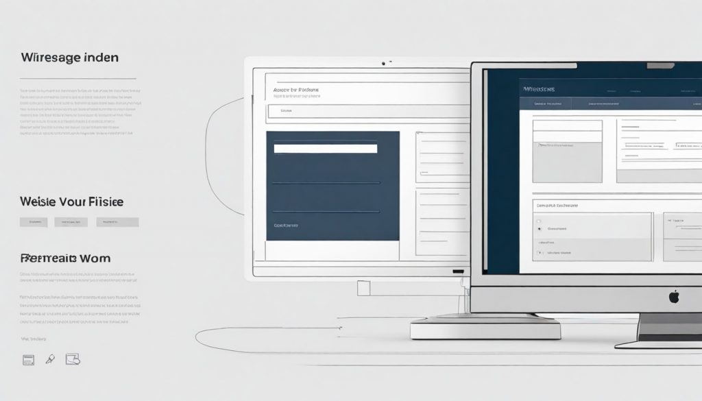
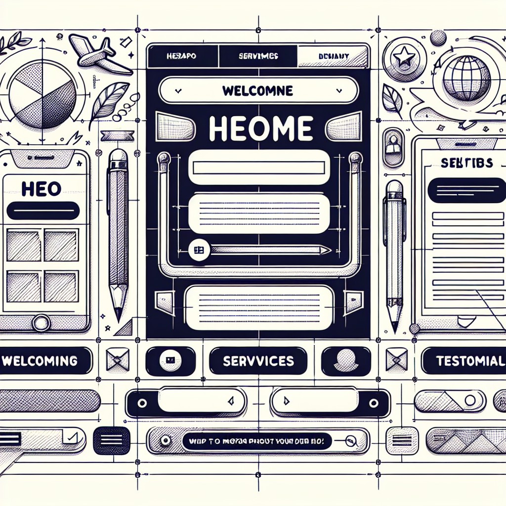
Balsamiq is a powerful wireframing tool that allows designers to create mockups and prototypes quickly and efficiently. It is widely regarded as one of the best wireframing tools available due to its user-friendly interface and extensive features. With Balsamiq, designers can easily create wireframes that accurately represent their design ideas and concepts. Wireframing is an […]

Revolutionize Your Wireframing Process with Balsamiq: A Comprehensive Guide Read More »

Two people discuss and design mobile app interfaces, surrounded by sketches, wireframes, and screens pinned to a corkboard with notes, illustrating a collaborative UX Design process with interactive prototypes.

Mastering UX Design with Axure: Tips and Tricks for Creating Interactive Prototypes

Axure is a powerful prototyping tool that is widely used in the field of User Experience (UX) design. It allows designers to create interactive wireframes, mockups, and prototypes that simulate the functionality and user experience of a product. Axure plays a crucial role in the UX design process as it helps designers visualize and test

Mastering UX Design with Axure: Tips and Tricks for Creating Interactive Prototypes Read More »

A variety of digital devices, from monitors to smartphones, display the same modern website design. Arranged neatly with plants and office accessories, they highlight tips from the Complete Guide to Website Mockup Design.

Website Mockups – Comprehensive Guide To Website Mockup Design

How to Create a Website Mockup — Complete Guide to Website Mockup Design The Complete Guide to Creating Stunning Website Mockups Are you looking to create a visually appealing and functional website design? Look no further! In this comprehensive guide, we will walk you through the process of creating stunning website mockups. From understanding the

Website Mockups – Comprehensive Guide To Website Mockup Design Read More »

Illustration of multiple smartphones, tablets, and monitors displaying web pages, wireframes, mockups, and prototypes, all arranged on a desk to represent digital connectivity and technology.

Wireframe vs Mockup vs Prototypes – Which Website Design Process To Use?

The Difference Between Wireframe vs Mockups vs Prototypes – Which Website Design Process To Use? Wireframe vs Mockups vs Prototypes – Which Website Design System To Use? Are you confused about the difference between wireframes, mockups, and prototypes? In the realm of design, these terms can often be used interchangeably, leading to misconceptions and misunderstandings.

Wireframe vs Mockup vs Prototypes – Which Website Design Process To Use? Read More »

Close-up of raised, engraved text on a metallic plaque, emphasizing the words “must heed all warnings and bodily injury.” Much like choosing the correct webfont for your project, attention to detail ensures clarity and safety. The image has a warm, vintage tone.

Choosing the Correct Webfont for Your Project

Chosing the Correct Webfont for Your Project: A Comprehensive Guide for Aspiring Web Designers As an aspiring web designer, one of the crucial decisions you’ll make is choosing the correct webfont for your project. The right choice can significantly enhance the overall appearance and readability of your website, while the wrong choice can leave visitors

Choosing the Correct Webfont for Your Project Read More »

Two smartphones illustrate Principles of Mobile Optimisation: the left displays a checklist with colored icons, while the right features a large yellow star above a green “BUY NOW” button on a vibrant blue background.

Principles of Mobile Website Optimisation – Mobile-Friendly Responsive Design Principles

Principles of Mobile Website Optimisation – Mobile-Friendly Responsive Design Principles The Principles of Mobile Optimisation: Enhancing User Experience Mobile optimization has become a crucial aspect of website design and development. With the increasing number of internet users accessing the web via their mobile devices, it is essential for businesses to prioritize mobile optimization to reach

Principles of Mobile Website Optimisation – Mobile-Friendly Responsive Design Principles Read More »

Scroll to Top