


Chosing the Correct Webfont for Your Project: A Comprehensive Guide for Aspiring Web Designers
As an aspiring web designer, one of the crucial decisions you’ll make is choosing the correct webfont for your project. The right choice can significantly enhance the overall appearance and readability of your website, while the wrong choice can leave visitors feeling unimpressed and confused.
In this step-by-step guide, we will walk you through the process of selecting the perfect webfont. From understanding the importance of website fonts to exploring the best and worst font examples, this comprehensive blog post will equip you with the knowledge and inspiration needed to make informed decisions and create visually appealing websites.
Importance of Website Fonts:
Website fonts play a vital role in conveying your brand’s personality and creating a positive user experience. Here are some reasons why selecting the right webfont is essential:
- Readability: Clear and legible fonts ensure that visitors can effortlessly read the content on your website, regardless of the device they are using.
- Consistency: A consistent font choice throughout the website establishes a cohesive and professional look, making it easier for users to navigate.
- Brand Representation: Fonts can transmit the desired emotions and values associated with your brand. A well-chosen font adds depth and shape to your brand identity.
Typography for Websites: Key Considerations
1. Assess Your Target Audience:
Understanding your target audience is crucial when choosing a webfont. Consider their demographics, preferences, and the purpose of your website. Are you targeting a younger audience, or a more mature one? Is your website for a creative industry or a more formal setting? These factors will help you narrow down your font choices.
2. Establish a Hierarchy:
Fonts have different weights, sizes, and styles that can be used to denote hierarchy and guide visitors through your website. Establishing a clear typographic hierarchy will enhance the visual appeal and readability of your content.
3. Consider Device Compatibility:
Opt for webfonts that are compatible across various devices and browsers. Responsive design is a must in today’s mobile-first world, so ensure your chosen fonts are responsive and scalable to provide a seamless experience.
4. Test for Legibility:
Before making a final decision, test your font choices for legibility. Check if the fonts are easy to read across different screens and sizes. Don’t compromise on readability for the sake of aesthetics.
Choosing Website Fonts: Best Practices and Examples
Now that we’ve covered the key considerations, let’s dive into some best practices for choosing website fonts and explore examples of both the best and worst font choices.
Best Website Fonts:
Choosing the best website fonts involves finding a balance between aesthetics, legibility, and compatibility. Here are a few popular choices:
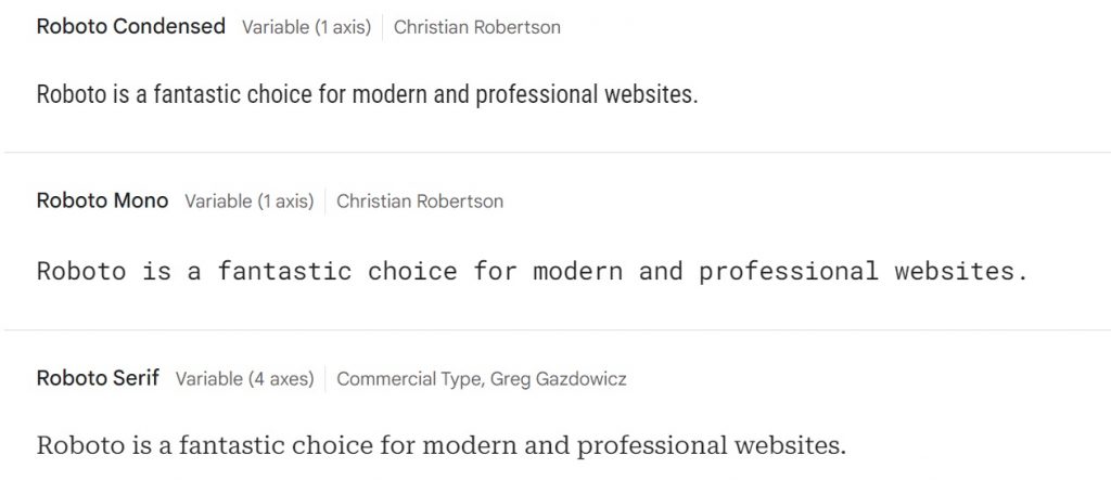
Roboto
With its clean lines and versatility, Roboto is a fantastic choice for modern and professional websites.
Open Sans
Open Sans is a highly legible font that works well in both print and digital media. It is widely used due to its simplicity and versatility.
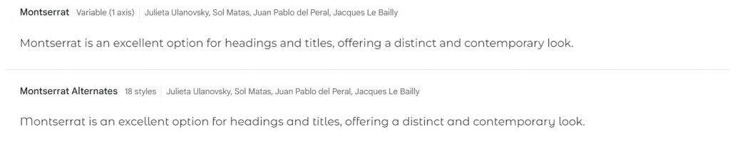
Montserrat
Montserrat is an excellent option for headings and titles, offering a distinct and contemporary look.
Raleway
Raleway is often used for headings and titles to create a professional and polished look. Its simplicity and readability also make it an ideal font for body text in brochures, websites, and presentations.
Worst Website Fonts:
To avoid making poor font choices, stay away from these examples:
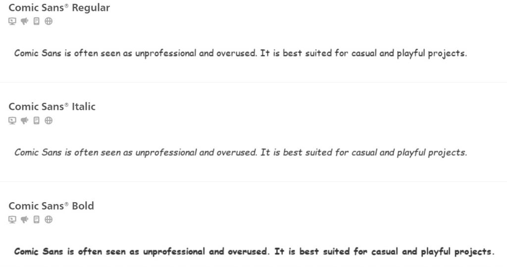
Comic Sans
Comic Sans is often seen as unprofessional and overused. It is best suited for casual and playful projects.
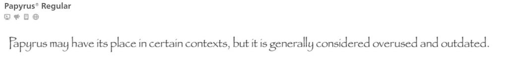
Papyrus
Papyrus may have its place in certain contexts, but it is generally considered overused and outdated.
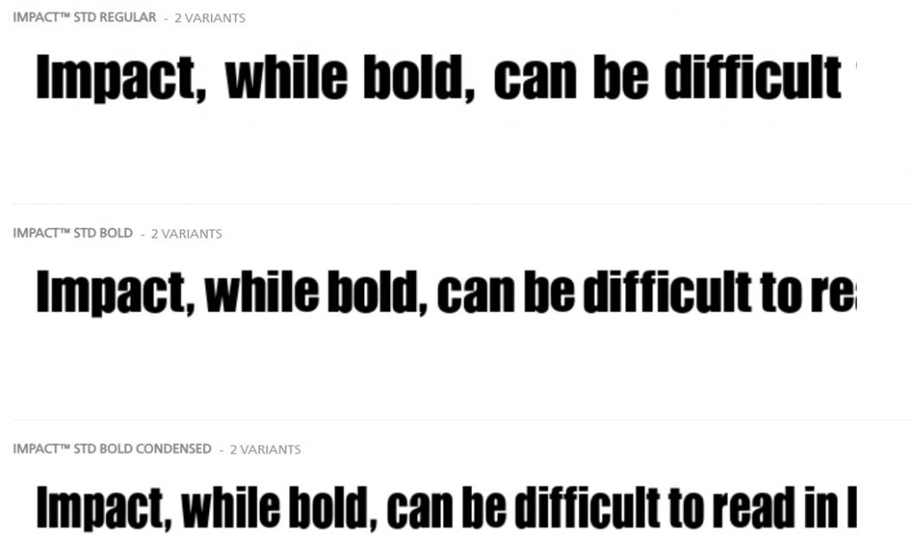
Impact
Impact, while bold, can be difficult to read in large amounts of body text due to its heavy strokes.
How to Use Google Fonts with Code Examples
With the vast array of fonts available, it’s important to choose the right ones that align with your website’s style. Fortunately, Google Fonts provides a wide selection of high-quality, easy-to-use fonts. In this article, we will explore how to utilize Google Fonts effectively, including code examples, and discuss the optimal placement of the code within an HTML web page.
Using Google Fonts: The Basics
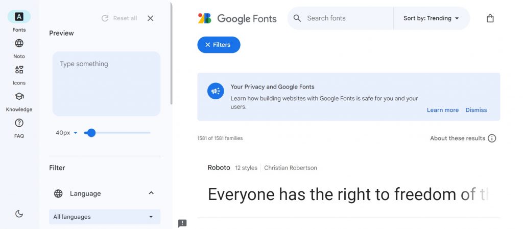
Google Fonts offers a diverse library of free, open-source fonts that can be easily integrated into any web page. To begin, visit the Google Fonts website (fonts.google.com) and explore the extensive collection. Once you have chosen the fonts that best suit your needs, follow these steps:
Step 1: Selecting Fonts
When on the Google Fonts website, browse through the available fonts, using filters and categories to narrow down your options. Simply click on the ‘Add’ button below each font you wish to incorporate into your project.
Step 2: Customizing Fonts
Google Fonts offers various customization options to ensure your chosen fonts integrate seamlessly with your website’s design. Adjust the font weight, style, and subsets (which languages to support) to tailor the fonts precisely to your requirements.
Step 3: Embedding the Code
After customizing your fonts, click on the ‘Embed’ tab. Here, you will find the code snippets necessary to integrate the selected fonts into your web page. Google Fonts provides two options: ‘Standard’ and ‘@import.’ For performance reasons, it’s recommended to use the ‘Standard’ option, as it loads fonts asynchronously.
Where to Place the Code within the HTML Web Page: Best Practices
Proper placement of the code within the HTML web page ensures that the fonts load efficiently, enhancing both aesthetics and performance. Let’s explore the recommended practices for placing the code snippets appropriately:
- Within the HTML Head Section:
It is advisable to place the code snippet provided by Google Fonts within the<head>section of your web page. This ensures that the fonts are loaded and rendered before any content is displayed to the user. To do this, insert the following code within the opening and closing<head>tags of your HTML document:
<link rel="stylesheet" href="https://fonts.googleapis.com/css2?family=Font+Name&display=swap" rel="stylesheet">
Replace 'Font+Name' with the actual name of the font you want to use, ensuring that the spaces in the font name are replaced with ‘+’. Multiple fonts can be included by separating them with the | symbol.
2. Applying the Font to Specific Elements:
Once the code snippet is placed within the <head> section, you can apply the chosen font to specific elements in your HTML document. To apply a Google Font, simply add the CSS font-family property to the desired element within the opening and closing <style> tags of your HTML document. For example:
<style>
  h1 {
    font-family: 'Font Name', sans-serif;
  }
</style>
Remember to replace 'Font Name' with the actual name of the font you have selected.
In summary, by following these steps and best practices, you can effectively use Google Fonts within your HTML web page, enhancing the visual appeal and user experience. Remember to balance aesthetics with performance by selecting only the necessary fonts and optimizing their placement within your web page. Happy designing!
Conclusion
Congratulations! You now have a comprehensive understanding of how to choose the correct webfont for your project. Remember to consider your target audience, establish a typographic hierarchy, and test for readability across devices.

I am a self-motivated, passionate website designer and developer. I have over ten years of experience in building websites and have developed a broad skill set including web design, frontend and backend development, and SEO.
Using my growing knowledge base I have built my own company (scriptedart.co.uk) creating websites, e-commerce stores and producing custom graphics and web app functionality for a range of local businesses.