

The Importance Of Mobile First Design Strategy over Responsive Design

What’s the Big Deal About Mobile-First Approach?
Mobile technology has revolutionized the way we access information and connect with the world and so is the importance of the mobile first approach.
This is different from responsive design which normally starts with building the desktop version first and then using CSS to change that content to fit smaller screens. Most web designers use desktop screens (and large desktop screens at that) when writing code so it is intuitive that they start the design for such screens first. Additionally, it is common to create most content for desktop users and then possibly remove elements altogether for smartphone users. This is not only due to the space available for content but also concerns about reduced bandwidth (performance) on mobile networks.
So with the above advantages of responsive design, why would anyone choose to use the mobile-first design approach?
Well with the increasing popularity of mobile phones and tablets, people are now relying more than ever on mobile devices to browse the internet, shop online, and interact with various applications. This shift in user behaviour has prompted businesses to prioritize mobile-first design and development strategies. In this article, we will explore why mobile first is such a big deal in today’s digital landscape.
The Mobile-First Design Strategy -Mobile before Tablet and Desktop
The mobile-first approach is a design philosophy that prioritizes the mobile user experience over the desktop experience. Design mobile to desktop rather than desktop to mobile site. It involves creating websites and applications for small screens but also responsive for large screens. Website design that loads quickly, and provides an optimal experience on mobile devices. Instead of starting with the desktop version and then adapting it for mobile, the mobile-first strategy advocates for designing for mobile devices first and then scaling up for larger screens.
The Rise of Mobile Internet Usage And Responsive Web Design
The rise of mobile internet usage has been nothing short of remarkable. According to recent statistics, more than half of all global internet traffic now comes from mobile devices. This trend is not limited to specific regions or demographics. People from all walks of life, across the globe, are increasingly accessing the internet through their mobile devices.
With mobile devices becoming the primary means of internet access for many users, it is crucial for businesses to ensure that their online presence is mobile-friendly. Websites that are not optimized for mobile devices may lead to a poor user experience, slow loading times, and a high bounce rate.
The Importance of Mobile-First Indexing
Mobile-first indexing is another reason why mobile-first design and development have become essential. In simple terms, it means that search engines like Google primarily use the mobile version of a website to determine its rankings in search results. If a website is not responsive and fails to provide a good mobile experience, it may suffer in terms of search visibility and organic traffic.
By adopting a mobile-first approach, businesses can improve their chances of ranking higher in mobile search results. This can lead to increased visibility, more organic traffic, and ultimately, higher conversion rates.
Embracing Mobile-First Design: A Blueprint for Success
- What is Mobile-First Design? Mobile-first design is an approach that involves designing and developing a website primarily for mobile devices and then expanding it to larger screens. It focuses on optimizing the user experience for mobile users while ensuring responsiveness across all devices.
- Benefits of Mobile-First Website By adopting a mobile-first approach, businesses can unlock numerous benefits. These include improved website performance, enhanced user engagement, increased mobile search visibility, and broader accessibility to a larger user base.
- Mobile First Design Strategy: Best Practices To create a successful mobile-first design, web designers must adhere to several best practices. These include prioritizing content hierarchy, simplifying navigation, leveraging responsive frameworks, optimizing for mobile loading speed, and designing with touch-friendly elements.
- Responsive Design: A Closely Aligned Strategy Responsive web design is closely related to mobile-first design. It ensures that websites dynamically adjust their layout, content, and functionality based on the user’s device screen size and orientation. By combining responsive design techniques with a mobile-first approach, businesses can provide a seamless multi-device experience.
Designing the Mobile-First Way: Insights and Strategies
Mobile-First Design Process: Step-by-Step Approach
Implementing a mobile-first design requires careful planning and execution. Web designers must understand user behavior and preferences, define mobile design goals, create wireframes, and conduct thorough testing and optimization.
Designing for Mobile Devices: Key Considerations
When designing for mobile devices, it is essential to consider factors such as screen size, touch gestures, limited real estate, and varying connection speeds. By optimizing the design for these considerations, businesses can provide a superior mobile user experience.
Crafting a Mobile-First User Experience
A mobile-first design places the user experience at the forefront. By considering user context, behavior, and needs, businesses can create intuitive and efficient mobile interfaces. Key elements include seamless navigation, clear calls-to-action, intuitive forms, and fast-loading pages.
III. Mobile-First Design: Realizing the Full Potential
The Impact of Mobile-First on User Engagement
Mobile-first design can significantly enhance user engagement by providing a cohesive and personalized experience across all devices. Websites optimized for mobile devices are more likely to attract and retain users, ultimately leading to increased conversions and customer satisfaction.
Mobile-First Design Principles: A Guide for Success
To excel in mobile-first design, businesses should adhere to key principles, including simplicity, performance optimization, consistent branding, usability testing, and continuous improvement. By incorporating these principles, websites can deliver exceptional mobile experiences.
Competitive Advantage
In a highly competitive online marketplace, staying ahead of the curve is crucial. Adopting a mobile-first approach can give businesses a competitive advantage by meeting the needs and expectations of mobile users.
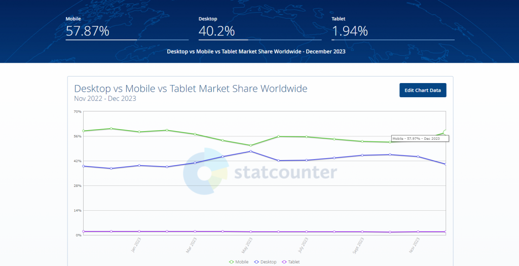
According to StatCounter the amount of mobile usability is averaging 57.87 % in 2023 compared to Desktop’s 40%. This means that website owners would benefit from a mobile-first web design to match the increase in the mobile market.
Since the number of mobile users is likely, by using a mobile-first approach and by providing a seamless and enjoyable mobile ux design, businesses can differentiate themselves from the competition and increase customer loyalty.
Conclusion – Design Different: Implement a mobile-first product design Process
In conclusion, the rise of mobile technology, the increasing adoption of mobile audiences, and the importance of mobile-first indexing have made mobile-first design and mobile development strategies imperative for businesses. By prioritizing mobile user experience, businesses can enhance user satisfaction, improve search visibility, gain a competitive advantage, and ultimately drive business growth. Embracing the mobile-first approach is not just a trend, but a necessity in today’s mobile-dominated world.

I am a self-motivated, passionate website designer and developer. I have over ten years of experience in building websites and have developed a broad skill set including web design, frontend and backend development, and SEO.
Using my growing knowledge base I have built my own company (scriptedart.co.uk) creating websites, e-commerce stores and producing custom graphics and web app functionality for a range of local businesses.