

Responsive Design – Comprehensive Guide to Responsive Web Design
Responsive Design – Ultimate Guide to Make Your Website Responsive
Responsive design is an essential aspect of modern web development. With the increasing usage of mobile devices, it has become crucial for websites to adapt and provide a seamless user experience across different screen sizes and resolutions. In this comprehensive guide, we will delve into the intricacies of responsive design and explore its benefits, implementation strategies, and best practices.
What is Responsive Web Design?
Responsive design is an approach to web development that aims to create websites that automatically adjust their layout and content based on the user’s device, screen size, and orientation. The goal is to provide an optimal viewing and interaction experience, ensuring that users can easily navigate and consume website content, regardless of the device they are using.
Responsive Website Design VS Adaptive Design
When it comes to designing websites, two popular approaches that often come into play are responsive design and adaptive design. While both methods aim to enhance the user experience across various devices, they differ in their approach.
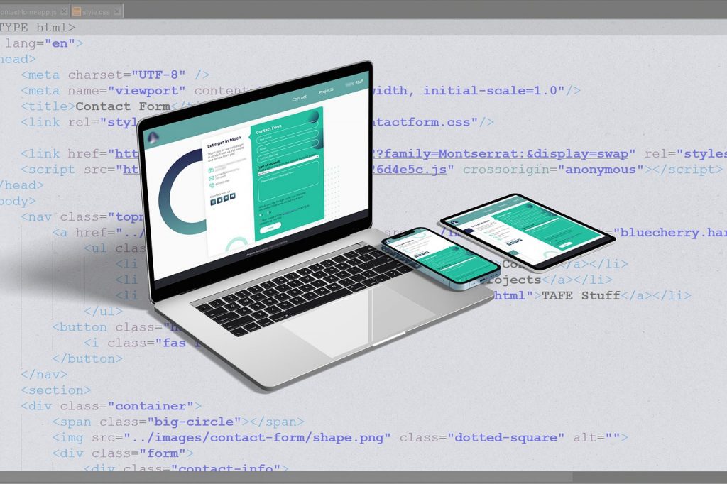
Responsive Web Design Example
Responsive website design utilizes fluid grids, flexible images, and media queries to create a seamless user experience regardless of the screen size. This means that a website designed responsively will automatically adjust its layout and content to fit any device, whether it’s a desktop computer, tablet, or smartphone. For instance, consider the following code snippet:
@media screen and (max-width: 600px) {
  .container {
    width: 100%;
    padding: 10px;
  }
  .image {
    width: 50%;
  }
}
This media query targets screens with a maximum width of 600 pixels, and dynamically adjusts the container and image sizes accordingly.
Adaptive Web Design Example
On the other hand, adaptive design focuses on building specific layouts for different devices. Instead of using fluid grids, it employs device detection to determine which layout should be served to a particular device. This ensures that the website is optimized for each device’s specific capabilities and limitations. While adaptive design necessitates more code and maintenance, it allows for a more tailored user experience. For example, the following code shows a potential implementation of adaptive design:
if (device === 'tablet') {
  // Load tablet-specific layout
} else if (device === 'smartphone') {
  // Load smartphone-specific layout
} else {
  // Load desktop layout
}
Both responsive and adaptive design have their merits, depending on the specific requirements of a project. Responsive web design offers a more unified user experience, while adaptive design provides a more customized experience.
The Benefits of Responsive Design For Your Website
Adopting responsive design brings a myriad of benefits for both website owners and users. Here are some key advantages:
- Improved User Experience: Responsive websites are user-friendly and provide a consistent experience across devices. Users can effortlessly navigate through the site, resulting in increased engagement and satisfaction.
- Wider Audience Reach: With the proliferation of smartphones and tablets, responsive design allows your website to reach a broader audience. Regardless of the device they use, users can easily access and interact with your content.
- Better SEO Performance: Responsive design is favoured by search engines, as it eliminates the need for duplicate content on different URLs. This enhances your website’s visibility and improves its chances of ranking higher in search engine results.
- Cost and Time Efficiency: Maintaining a single website that caters to all devices is more cost-effective and time-efficient than managing separate websites for different platforms. With responsive design, you only need to make updates once, and they apply universally.
The Evolution of Responsive Web Design Methods:
Responsive web design has come a long way since its inception. It has evolved to meet the changing needs and preferences of users. From static layouts to fluid grids, responsive design has revolutionized the way websites are built. Let’s take a closer look at the key milestones in the evolution of responsive web design:
- Responsive Breakpoints and Adaptive Design: One of the fundamental concepts in responsive web design is the use of breakpoints. Breakpoints are predetermined screen widths at which the layout of a website changes to accommodate different devices. Adaptive design refers to the use of multiple layouts that are served based on the specific device’s capabilities and screen size.
- Mobile-First Design: With the prevalence of mobile devices, designers started adopting a mobile-first approach. This means designing websites starting from the smallest screen size and progressively enhancing the layout for larger screens. This approach ensures that the mobile user experience is prioritized and optimized.
- Responsive Images: Images play a crucial role in web design, and responsive images are essential for a seamless user experience. Responsive images dynamically adjust their size and resolution based on the user’s device, ensuring fast loading times and optimal display quality.
Components of Responsive Web Design:
Responsive web design comprises various components that work together to create a dynamic and user-friendly website. Here are the key components of responsive web design:
Grid Layout: Fundamental Concept of Responsive Web Design
A responsive website relies on a flexible grid system that adapts to different screen sizes. By using fluid grid layouts, designers can ensure that the website’s content is organized and visually appealing across devices.
When it comes to designing websites, one of the most effective and efficient techniques to consider is using grid website design. Grid design provides structure and organization, creating a visually appealing layout that engages users. Not only does it enhance the overall aesthetic, but it also improves the usability and navigability of the website. By implementing a grid system, elements such as text, images, and buttons can be placed in a well-defined and consistent manner, ensuring a cohesive user experience. Furthermore, grid design allows for easy responsiveness across different devices, making the website accessible to users on both desktop and mobile. To illustrate the power of grid design, let’s take a look at a simple code example:
<div class="container">
  <div class="row">
    <div class="col-4">
      <!-- Content goes here -->
    </div>
    <div class="col-4">
      <!-- Content goes here -->
    </div>
    <div class="col-4">
      <!-- Content goes here -->
    </div>
  </div>
</div>
In this code snippet, a basic grid structure is created using CSS classes. The container class acts as the main wrapper, while the row class is used to define a horizontal row within the container. Within each row, we have three columns, each represented by the col-4 class. By assigning different column classes, we can adjust the width and layout of the content accordingly. This code example demonstrates how easily grid design can be implemented, providing a solid foundation for your website layout. So why not harness the power of grid website design and take your website to the next level, captivating users with its beautiful organization and seamless navigation?
Media Queries – The Building Blocks of Responsive Web Design
Media queries are CSS techniques that allow designers to apply different styles and layouts based on the user’s device characteristics, such as screen size, resolution, and orientation. Media queries are essential for creating responsive websites that can adapt to a wide range of devices.
Are you a web developer looking to create responsive designs that adapt beautifully to different screen sizes and devices? Look no further than media queries! This powerful tool allows you to create different stylesheets based on specific conditions, making your website look great across all platforms. By utilizing media queries, you can effortlessly achieve a flawless user experience on smartphones, tablets, and desktops. Let me show you how simple it is to use. To begin, you’ll need to define your breakpoints – the points where your design changes to accommodate different screen sizes. For instance, you might choose to set breakpoints at 768px, 1024px, and 1440px, covering the most common device widths. Here’s an example of media queries in CSS:
@media only screen and (max-width: 768px) {
/* Styles for screens with a maximum width of 768px /
}
@media only screen and (min-width: 769px) and (max-width: 1024px) {
/ Styles for screens with a minimum width of 769px and a maximum width of 1024px /
}
@media only screen and (min-width: 1025px) and (max-width: 1440px) {
/ Styles for screens with a minimum width of 1025px and a maximum width of 1440px */
}
With these media queries, you can specify different CSS rules for each breakpoint, ensuring your website adapts to screens of various sizes. This means you have full control over your design, whether it’s adjusting font sizes, rearranging layout elements, or hiding certain elements on smaller screens. Don’t let your website be left behind in this mobile-first era; embrace the power of media queries and provide an outstanding user experience across all devices.
Design Trends:
Responsive web design is not just about functionality; it also includes aesthetic considerations. Design trends play a crucial role in creating visually appealing and modern websites that engage users. Staying up-to-date with design trends ensures that your responsive website stands out from the competition.
How to Create a Responsive Website:
Now that we understand the evolution and components of responsive web design, let’s explore how to create a responsive website. Here are some key steps to follow:
Understand Your Target Audience:
Before diving into the design process, it’s essential to understand your target audience and their device preferences. Analyze your website analytics data to gain insights into the devices your visitors are using. This information will help you prioritize your design efforts.
Implement a Mobile-First Approach?
Mobile technology has revolutionized the way we access information and connect with the world and so is the importance of the mobile-first approach.
This is different from responsive design which normally starts with building the desktop version first and then using CSS to change that content to fit smaller screens. Most web designers use desktop screens (and large desktop screens at that) when writing code so it is intuitive that they start the design for such screens first. Additionally, it is common to create most content for desktop users and then possibly remove elements altogether for smartphone users. This is not only due to the space available for content but also concerns about reduced bandwidth (performance) on mobile networks.
Use Responsive Images:
By using responsive images, you can enhance the user experience and boost your website’s performance.
One powerful technique to achieve responsive images is by utilizing the srcset attribute in HTML. This attribute allows you to provide multiple image sources, each tailored for different screen resolutions. By including code examples using srcset, you can easily demonstrate how to implement this technique. For instance, you can specify different image sizes and resolutions using the “w” descriptor, as follows:
< img src="image.jpg" srcset="image-640.jpg 640w, image-1024.jpg 1024w, image-1920.jpg 1920w" alt="Responsive Image" />When the browser encounters this code, it can choose the most appropriate image to display based on the device’s capabilities. This means that users will always see the best quality image while minimizing the page load time.
Test and Iterate:
After designing and developing your responsive website, it’s crucial to thoroughly test it across various devices, browsers, and screen sizes. Identify any issues or inconsistencies and make necessary adjustments to deliver a seamless user experience.
Why Mobile Responsive Design Matters
Mobile responsive design is no longer just a nice-to-have feature, but rather a crucial aspect of any successful website. With the increasing number of people using their mobile devices to browse the internet, it has become imperative for businesses to prioritize a mobile-friendly user experience.
According to Statista, as of 2021, mobile devices accounted for more than half of the global website traffic. This statistic alone highlights the significance of optimizing websites for mobile devices.
By employing mobile responsive design, websites adapt seamlessly to the screen size and resolution of different mobile devices, providing users with an optimal viewing experience regardless of the device they use.
Take, for example, the use of media queries in CSS. By adding a simple line of code, such as “@media screen and (max-width: 768px)”, web developers can define specific styles for different screen sizes. This ensures that the content and layout of a website are adjusted accordingly, making it easier to navigate and read on smaller screens.
Additionally, implementing responsive design can also positively impact a website’s performance.
Google’s Mobile-First Indexing, which prioritizes mobile-friendly websites in search rankings, further emphasizes the importance of mobile optimization. A slow-loading, non-responsive website may result in higher bounce rates and ultimately, a loss in potential customers. In a study conducted by Google, it was found that 53% of mobile users would abandon a site if it takes more than 3 seconds to load.
These compelling statistics and real-world examples serve as strong evidence for the necessity of mobile responsive design. Ultimately, by prioritizing mobile responsive design, businesses can improve their online presence, increase user engagement, and drive more conversions.
Conclusion
Responsive design is no longer optional but a necessity in today’s digital landscape. By implementing responsive design principles, you can create websites that adapt flawlessly to different devices, providing an enhanced user experience and maximizing your website’s reach. Embrace the mobile-first approach, utilize fluid grids and flexible images, leverage media queries, and thoroughly test your design. With a comprehensive understanding of responsive design, you can future-proof your website and better engage with your audience.

I am a self-motivated, passionate website designer and developer. I have over ten years of experience in building websites and have developed a broad skill set including web design, frontend and backend development, and SEO.
Using my growing knowledge base I have built my own company (scriptedart.co.uk) creating websites, e-commerce stores and producing custom graphics and web app functionality for a range of local businesses.