Prioritize Visible Content For An Improved Google Pagespeed Insights Score
This is part of our guide on improving page speed using the Google pagespeed insights developer tool. In this article we are discussing how to prioritize visible content. We will be writing this article for novices using plain English and attempting to add a little more light to the explanation given by Google.

What is visible content?
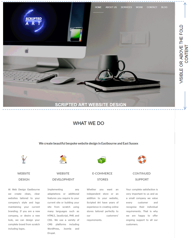
Visible content (also known as above the fold content) is what a user first sees on a website without scrolling down. This is normally the title and navigation menu as shown in the diagram.
Why Prioritize Visible Content?
Many webpages are fairly large and no user wants to wait for an entire page to load before they see any visible content. Loading the visible content before other elements of a page creates a much better user experience.
How to Prioritize Visible Content?
There are many ways to reduce the loading time of the above the fold or visible content and thus prioritizing this content.
One way is to reduce the amount of files required to display this content which reduces download time and increases the load time. If you have been following this tutorial on Google Pagespeed Insights in order then you will have already reduced the memory of all images, CSS and HTML but if not this is a great place to start as much is covered here.

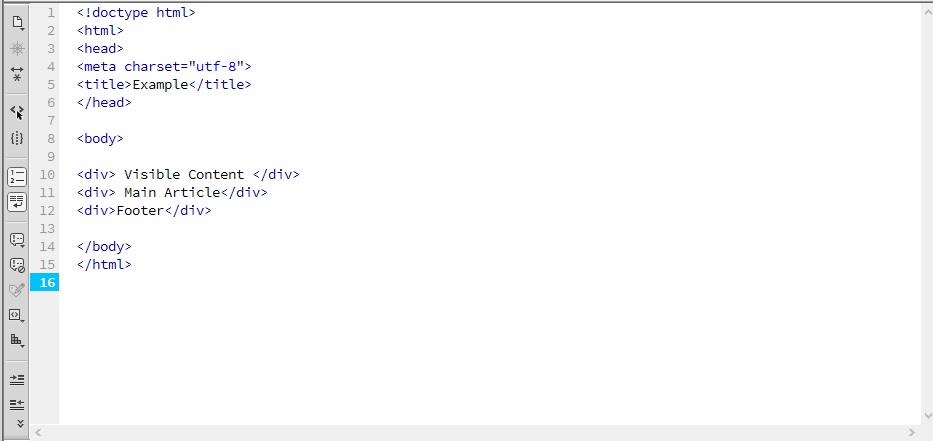
The next step is to make sure that the html required for the above the fold content is placed at the top of the html file (within the <body>……</body> tags).
This is because a web browser reads the html one line of code at a time and in order. So if you have placed the code for the visible content below another page element then the browser has to read and execute this code first.
To fix this simply cut and paste the html block that contains the visible content above all the other elements.
Another way to speed up the loading of the visible content is to place all the CSS required to display the content within the HTML file itself instead of a separate file. We explain how to do this below in the ‘How to eliminate render-blocking JavaScript and CSS in above-the-fold content’ section
When a web browser loads a website it follows a particular process
- First it downloads the HTML file.
- Then it reads through the HTML code line at a time
- If it requires a resource such as JavaScript, CSS or images it will download that resource
- If the resource is another file then it will read through that file before returning to the original html file
Harnessing the Power of Google’s Pagespeed Insights Tool
Google Page Speed Insights tool is a valuable resource for website owners and developers. It provides a detailed analysis of a web page’s performance, offering insights into areas that need improvement. By understanding the tool’s recommendations and implementing changes, you can significantly enhance your website’s speed, resulting in better user satisfaction and potentially higher search engine rankings.
CSS Optimization: Streamlining Style for Speed
Cascading Style Sheets (CSS) play a pivotal role in determining a website’s appearance. Optimizing CSS involves reducing file sizes, prioritizing critical styles, and implementing best practices. Techniques like inlining critical CSS directly into the HTML can prevent render-blocking, ensuring that above-the-fold content loads quickly and efficiently.
WordPress: A Catalyst for Speedy Above-The-Fold Content
WordPress, a popular content management system, can be a double-edged sword when it comes to page speed. While it offers flexibility and functionality, poorly optimized themes and plugins can hinder performance.
PageSpeed Ninja is a free plugin that is dedicated to improving the loading speed of your responsive website on both desktop and mobile platforms.
Two of it’s many features are:
- Resolve Render-Blocking Issues: Address render-blocking CSS and JavaScript issues to streamline loading.
- Enhancing Critical Rendering Path: Automatically generate critical CSS for above-the-fold content to improve the critical rendering path.
If you are using WordPress then this could well be the answer you’re looking for. It also may answer many other page speed issues such as
lazy load – which will defer the loading of images till required.
Cache Leveraging – To utilize browser and server-side caching for improved performance.
How to eliminate render-blocking JavaScript and CSS in above-the-fold content?
(you can find a more in-depth explanation about render-blocking JS & CSS here but to fix the issue continue reading)
The answer to this sounds simple. Move the requests for such files below the html that loads your above the fold content, right? Well yes that is correct and in fact, we place it right at the bottom of the code before the closing body tag but that does cause an issue.
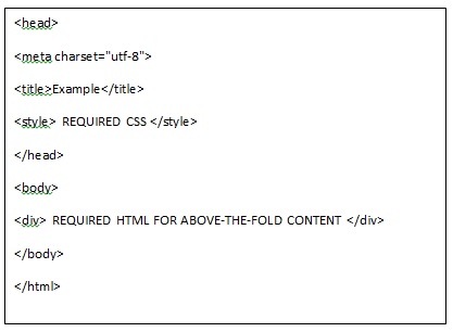
The above fold content requires information from the CSS file in order to display properly. So what we do is place all the CSS required to display the above-the-fold content within the html file itself. We place it within style tags above the html and within the header tags as shown below.

This now sounds more complicate however there are some tools that help us do this.
TOOL 1
The simplest tool I have found is “Sitelocity’s Critical Path Generator”
Simply enter your site address including the http:// or https:// and click the ‘GENERATE CRITICAL PATH CSS’ button. The tool will then automatically download your sites CSS file and copy the required section for the above the fold content. It then minifies the CSS and outputs it ready for you to input into your HTML file as described above.
TOOL 2
Another tool is the “Critical Path CSS Generator”
- enter your website address
- Paste your entire CSS file into the box indicated
- Hit the “create Critical Path CSS” button
Then it will generate the CSS required to display the above fold content. You then simply add the generated CSS into your html file as described above.
How to Load Fonts Asynchronously
This simply means fetching them from a server simultaneously without blocking the rendering of the rest of the website. By employing this approach, you can provide your users with a more enjoyable browsing experience while maintaining the aesthetics of your website’s typography.
- Using the Web Font Loader Library:
The Web Font Loader, developed by Google, is a valuable JavaScript library that allows you to control how and when web fonts are loaded. This library provides a simple and powerful mechanism to load fonts asynchronously. You can easily integrate it into your website by following these steps:
i. Include the Web Font Loader script in your HTML:
<script src="https://ajax.googleapis.com/ajax/libs/webfont/1.6.26/webfont.js"></script>
ii. Specify the fonts you want to load asynchronously by creating a configuration object:
WebFont.load({
  google: {
    families: ['Open Sans', 'Roboto']
  }
});
- Leveraging the Font Face Observer Library:
Another excellent tool to load fonts asynchronously is the Font Face Observer library. This lightweight JavaScript library helps ensure that your website only starts rendering once the fonts have been loaded. Follow these steps to incorporate the Font Face Observer library into your website:
i. Include the Font Face Observer script in your HTML:
<script src="https://cdnjs.cloudflare.com/ajax/libs/fontfaceobserver/2.0.13/fontfaceobserver.js"></script>
ii. Create an instance of the Font Face Observer and define the fonts you want to load asynchronously:
const font = new FontFaceObserver('Open Sans');
font.load().then(() => {
  console.log('Open Sans has loaded!');
});
- Combining Both Approaches:
To have even more control over font loading, you can combine the Web Font Loader and Font Face Observer libraries. This hybrid approach allows you to define fallback fonts and adds a layer of reliability to ensure a smooth loading experience.
How to handle An Image Optimization
We have a detailed guide about image optimization here which also has a free image compression tool.
Images below the visible content can be handled with lazy loading (loading as the user scrolls and not during the page load) which will reduce the amount of requests and render the above-the-fold content faster. Images within the visible section (such as your logo) however, need to be visible as soon as the page is loaded but they should be loaded as next-generation media images where possible. Unfortunately, not all browsers can handle webp images for example but we can solve the problem with the following code.
First you will need to convert jpg’s etc into webp format ( I like using this site for most media conversions as it’s free and has no watermark) then upload both versions.
Background Image
We can use something like this to fix the issue.
create an associated class for the div (I will use .optImg) and in one of your stylesheets add
<style>
.optImg {

         background-image: url(https://example.co.uk/images/example.jpg) no-repeat center center!important;

         background-image: image-set(url("https:/example.co.uk/images/example.webp") );
}
</style>
This tells the browser to load the image-set URL if it can be rendered but the normal URL if not.
Normal Image
The best solution to display a normal image where you need to render the webp image if possible you can use this HTML code.
<picture>

<source type="image/webp" srcset="https:/example.co.uk/images/example.webp">

<source type="image/png" srcset="https:/example.co.uk/images/example.png">

<img src="https:/example.co.uk/images/example.png" alt="example" loading="lazy">
</picture>
This will display your image above the fold in the appropriate format.
How To ‘Lazy Load’ Other Images In The Page
Lazy Load means requesting the images when they are required to render as in when the user scrolls down towards them. To do this we can use some JavaScript placed towards the bottom of the HTML file.
<script>

const images = document.querySelectorAll("[data-src]"); //find all images that have the data-src attribute


function preloadImage(img) {

const src = img.getAttribute("data-src")

if(!src){

return;

}

img.src = src;

}


const imgOptions = {

threshold: 0,

rootMargin: "0px 0px 400px 0px" //change the distance between where the scroll is and when the images load (increase for slower-to-load images)


};


const imgObserver = new IntersectionObserver((entries, imgObserver) => {

entries.forEach(entry => {

if (!entry.isIntersecting) {

return;

} else{

preloadImage(entry.target);

imgObserver.unobserve(entry.target);

}


});


}, imgOptions);


images.forEach(image => {

imgObserver.observe(image);

});


</script>
Then within the img tags we replace src=”” with data-src=””. Normally this prevents the images from loading at all but when the JavaScript runs, after page load, then it changes the data-src taghs back to src tags and the images will load.
Conclusion
Prioritizing visible content is essential for enhancing user experience and SEO ranking. By focusing on presenting important information upfront and optimizing page load time, website owners can significantly improve user satisfaction and engagement. The code example of lazy loading serves as a powerful technique to prioritize visible content. Remember, the key to success is optimizing user experience while complying with SEO standards. Start prioritizing visible content today and discover the positive impact it can have on your website’s performance.
Hopefully, you have found this useful and are well on your way to improving your site’s load speed. If you have any questions or have anything to add please let me know in the comments section below.

I am a self-motivated, passionate website designer and developer. I have over ten years of experience in building websites and have developed a broad skill set including web design, frontend and backend development, and SEO.
Using my growing knowledge base I have built my own company (scriptedart.co.uk) creating websites, e-commerce stores and producing custom graphics and web app functionality for a range of local businesses.


